Magazine Codes and Conventions
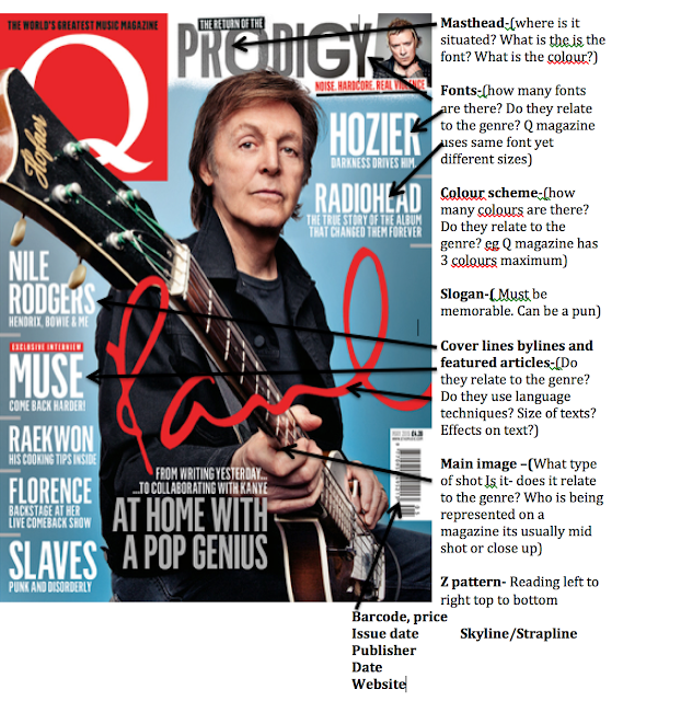
Codes and conventions- Systems of signs which create meaning. Codes are visual/ audio, coventions group together to make a genre.


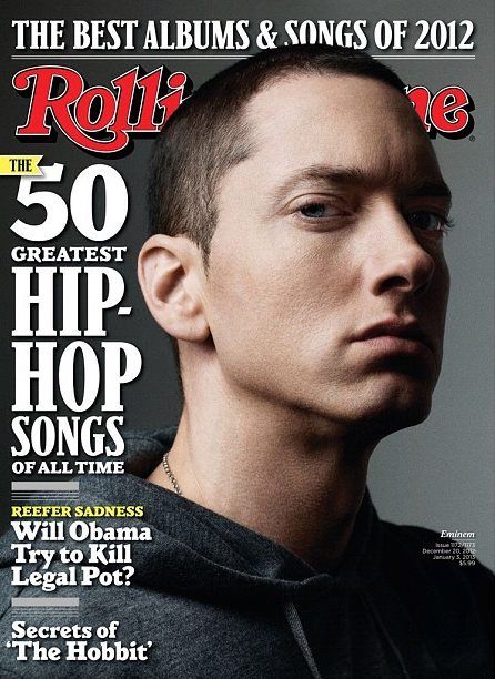
 Masthead- Same font and same size on every magazine. The deep red colour stands out on the dark grey background so people will be drawn to it.
Skyline- The fact it uses the word best will make people believe they are the greatest magazine and people will pick it up thinking that.
Main image- Eminem is a well know rapper. The close up shows the serious look on his face. Due to him having a big fan base more people will buy it. Eminem is also positioned in front of the title to assert his dominance.
Featured article- Biggest text will draw people in.
cover lines- rhetorical question makes you think and want to read more.
Colour scheme- The fact everything in the picture is grey makes the title pop as it is a bright red colour. Also there is a maximum of three colours- red, white and grey.
Z pattern- Reading this left to right top to bottom
Date and image detail- the writing explains who is in the image and when it was taken
Masthead- Large bold font will attract people attention. The white font on the blue background makes the title pop.
Main image- Justin Bieber stands in front of title to assert his dominance of what a big star he is.
Featured article- They use a quote and Justin name so people who see it think what he could be talking about and want to find out more. even if the quote is out of context.
Colour scheme- Blue white and green are the three main colours on this magazine. they use Bright colours as pop is a happy genre so they connote it will vibrant colours.
Puff- This puff trys to grab peoples attention
Z pattern-Reading from left to right top to bottom
In the rolling stone magazine they use a serif font as that magazine is aimed towards adults and it shows a more mature vibe to the company.
Bilboard magazine use a more playful and and bolder fonts and don't use serifs. This is because its aimed at the younger generation as its pop music so they want to be bold and tendy.
Font styles
Fonts vs type face
whats the difference?
Font and typefaces are two terms that are often incorrectly used interchangeably
A font is one particular weight and style of a larger typeface
Type faces are cotogories comprised of man different fonts. For example, serif is a typeface and times new roman is a font that is part of the serif family there are a variety of different typefaces and fonts.
Serif
Serif fonts are identifiable by small lines on the edges of letters called serifs that make the font easier to read in print. Fonts in the serif typeface include times new roman, Georgia, and book Antiqua.
Sans Serif
Sans serif font letters don't have serifs attached to them so they display more clearly on websites. Fonts in sans serifs include Ariel, Verdana and Helvetica.
Script
Fonts in script typeface are meant to imitate the fluididty of human handwriting. Fonts in script typeface include comic sans kristen and lucinda.
Modern or display
The modern typeface is characterised by variance between thin and thick bold lines the lettering. Fonts in modern typeface include impact, Rockwell and agency.
Monospaced
Monospaced fonts have larger spaces between each letters and were designed to look like text was written using a typewriter. Fonts in monospaces typeface include currier consolas and monaco
The study then produced a detailed breakdown of the fonts most commonly associated with both positive and negative emotions and personality traits the results are interring
- Serif fonts didn't receive any particular positive or negative personality accusations
- Script fonts were perceived as feminine funny and casual
- Modern fonts were categorised as masculine assertive and coarse
- Monospaced fonts were called dull plain and unimaginative

Comments
Post a Comment