pre production materials and documents


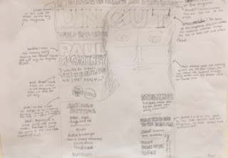
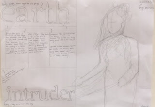
Some similarities between each UNCUT magazine is the size of fonts. for example each mastheads 3cm which is the biggest font size on the front cover. This is to attract the audience by its name and due to the fact its so big its noticeable. The headline on each UNCUT magazine is 2cm which will also attract the audiences attention and will make them buy the magazine to read the article. Also the main image in all the magazines seems to be on the right hand side which continues the trend on their magazine to make it look aesthetically pleasing. also each of the less important titles are 0.5cm big so people will pay more attention to the main image and the main headline rather than the other stories
Comments
Post a Comment